🏢 Selection Guide for Decorative Paintings for Hotel Commercial Projects
📋 Intro
Selecting wall art for hotels, restaurants, and commercial spaces isn't the same as picking decor for your home. Durability, consistency, brand fit, and scalability all matter. Today we're breaking down our best-selling rainy cityscape textured painting — why it works for hospitality projects, where it performs best, and what makes it suitable for bulk orders.
⚠️ The 3 Big Pain Points Of Commercial Art Sourcing
Before we talk about the painting itself, let's be honest about what drives project managers crazy:
1. Printed art looks cheap up close.
Guests don't consciously notice, but they feel it. Flat prints in lobbies and dining rooms make a space feel budget, no matter how nice the furniture is.
2. Inconsistent quality across bulk orders.
Order 20 pieces for a hotel floor and you get 20 slightly different shades, crooked frames, or varying finish quality. Consistency matters for brand standards.
3. Pieces don't hold up to high-traffic use.
Fading, warping, peeling, collecting dust — commercial spaces see way more foot traffic and light exposure than homes. Regular residential art fails fast.
This painting was built to solve all three.
✨ Why This Piece Works For Hospitality
It reads as "premium" from across the room — and up close.
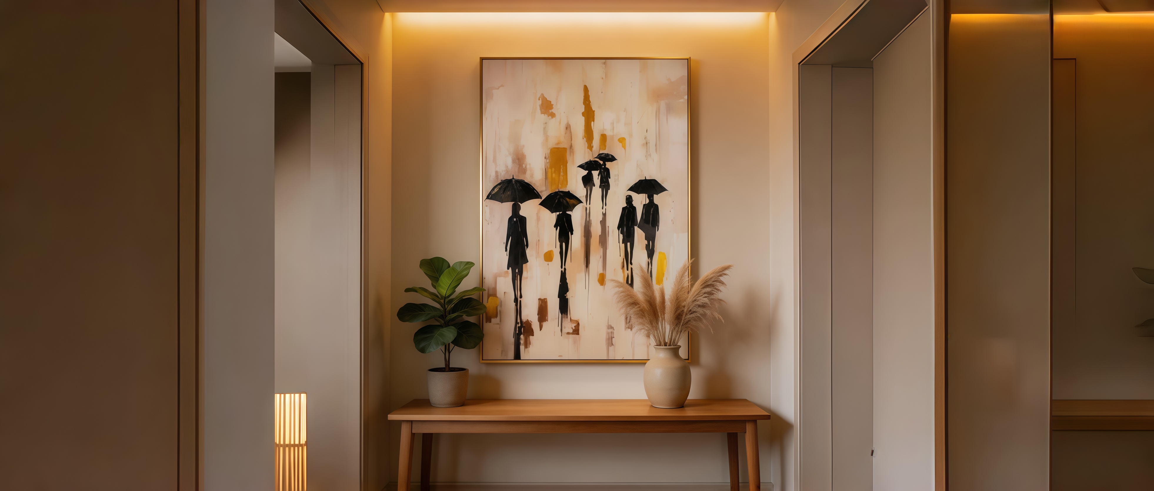
The thick impasto brushstrokes + embedded crystal rain droplets give it real depth and texture. From the entrance of a restaurant or hotel corridor, it looks rich and intentional. Walk up closer, and you see the dimensional paintwork and the subtle sparkle of the crystal accents — that's the "wow, this place is nice" moment you want guests to have.
The warm beige base with black silhouettes and golden amber accents is also incredibly versatile. It pairs with warm wood, black metal, leather seating, neutral stone — basically every popular commercial interior palette right now.
🔍 Craftsmanship Breakdown (What You're Actually Getting)
Thick impasto oil texture
Heavy-bodied paint applied with palette knives creates raised ridges and depth. The umbrella shapes and figure silhouettes have real physical dimension, not just a printed illusion.
Crystal rain droplet accents
Hand-set clear crystals along the rain lines catch light and add a subtle luxury sparkle. Not cheesy or overdone — just enough to elevate the piece from "nice" to "memorable."
Warm golden amber color blocks
The architectural background elements use a rich gold-amber tone that reads as warm and sophisticated. It's a color that photographs incredibly well for marketing shots.
Neutral beige base tone
Soft warm beige background — not stark white, not yellow cream. The middle ground that blends seamlessly with most commercial interior color schemes.
🏨 Four Commercial Spaces Where It Performs Best
Boutique Hotel Lobbies & Corridors 🏛️
The moody, atmospheric city vibe sets an elegant tone without being overpowering. It's sophisticated enough for a 4-star property and works beautifully in long corridors where guests walk past it daily. The vertical 80×120cm size fits standard hotel wall modules perfectly.
Cafés & Fine Dining Restaurants 🍴
Food and beverage spaces live or die by ambiance. This painting adds that urban, cultured feel — think modern European bistro or upscale coffee shop. The warm gold tones complement wood tables and warm lighting, making the whole space feel cozier and more inviting.
Corporate Offices & Co-Working Spaces 💼
Want your office to look established and creative, not sterile? This piece strikes that balance. The figurative subject matter is approachable and universally liked — no controversial abstracts, no boring landscapes. Great for reception areas, meeting rooms, and breakout lounges.
Lounge Bars & Clubhouses 🥂
The dramatic black + gold color story feels upscale and evening-appropriate. Under warm dim lighting, the crystal droplets catch the light beautifully. It's the kind of art that creates atmosphere without demanding attention — perfect for social spaces.
📦 5 Advantages For Project & Bulk Orders
✅ Consistent quality across every unit
Each piece follows the same master template with standardized material specs. Color, texture, and dimensions stay uniform across 5 pieces or 50 — critical for brand consistency across hotel floors or chain locations.
✅ Durable build for high-traffic areas
Thick canvas on solid wood frame, sealed paint surface, and securely set crystal elements. Designed to withstand regular cleaning, UV light exposure, and the wear-and-tear of public spaces.
✅ Custom size & format flexibility
Standard 80×120cm vertical works for most spaces, but we can adjust dimensions, color tones, or even modify the composition to match your project's specific design brief.
✅ Ready-to-install delivery
Every piece arrives framed, backed, and with hanging hardware pre-installed. Your installation team can mount them directly on delivery day — no extra framing or assembly needed.
✅ Cost-effective vs. original art
You get the look and texture of hand-finished art at a price point that works for project budgets. Much higher perceived value than printed canvas at a comparable cost.